Hidden Meaning Behind The Famous Logos.
May 25, 2019 • 221 views
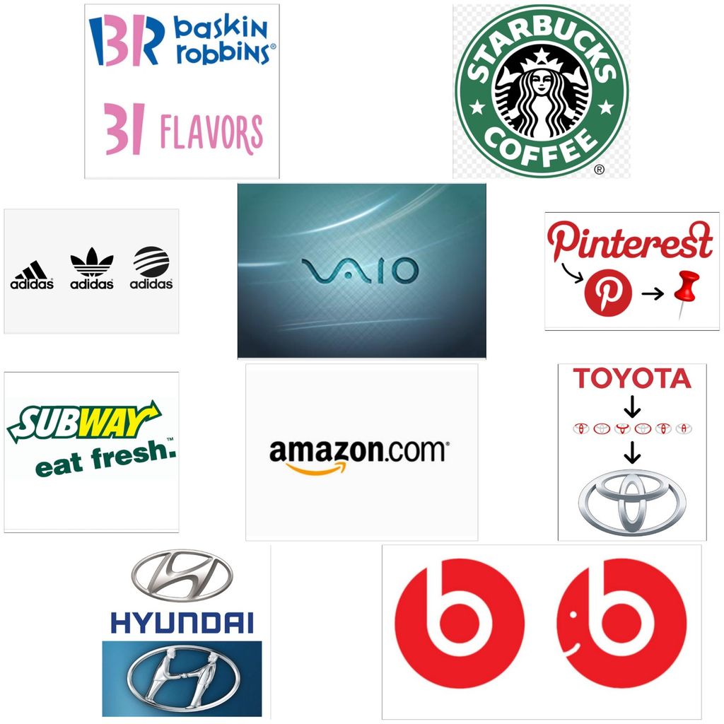
The logos are the representator of a company and by just looking at the logo we can figure out the name of the company and the product they sell but logos are not just the eye chatchy images, there is a clever and a deeper meaning behind there form.
The images are the result of very thoughtful process to make it unique and standout to make an impact on the minds of their costumers.
So, here are some logos of the famous companies and the hidden meaning behind their form:
1. Amazon.com.

It is one of the most famous online shopping site. The logo was adopted in 1998. The orange arrow from the alphabet "A" to "Z" represents that the company has every necessary product and it makes the costumers smile.
2. Baskin Robbins.
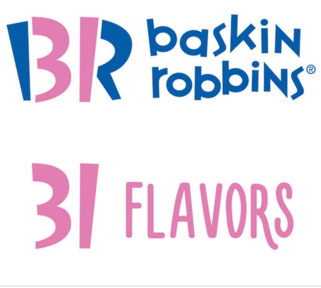
The company was created in 1953. The logo was made after the names of the owners of different ice cream parlors "Burt Baskin" and Irv Robbins who merged in together to form the ice hub which offers 31 different ice cream flovrs and logo clearly represents it.
3. Starbucks.
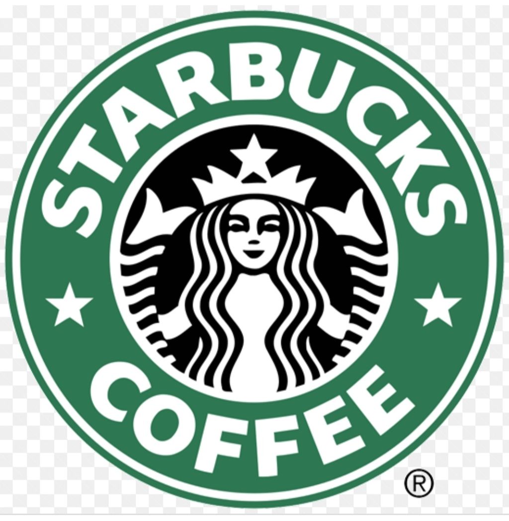
It is the American coffeehouse and the logo has a "twin-tailed-mermaid" or "Sire". The logo was inspired by the tale of a mermaid from Greek Mythology who lured the sailors.The logo is simply an exotic aesthetic design.
4. Toyota.
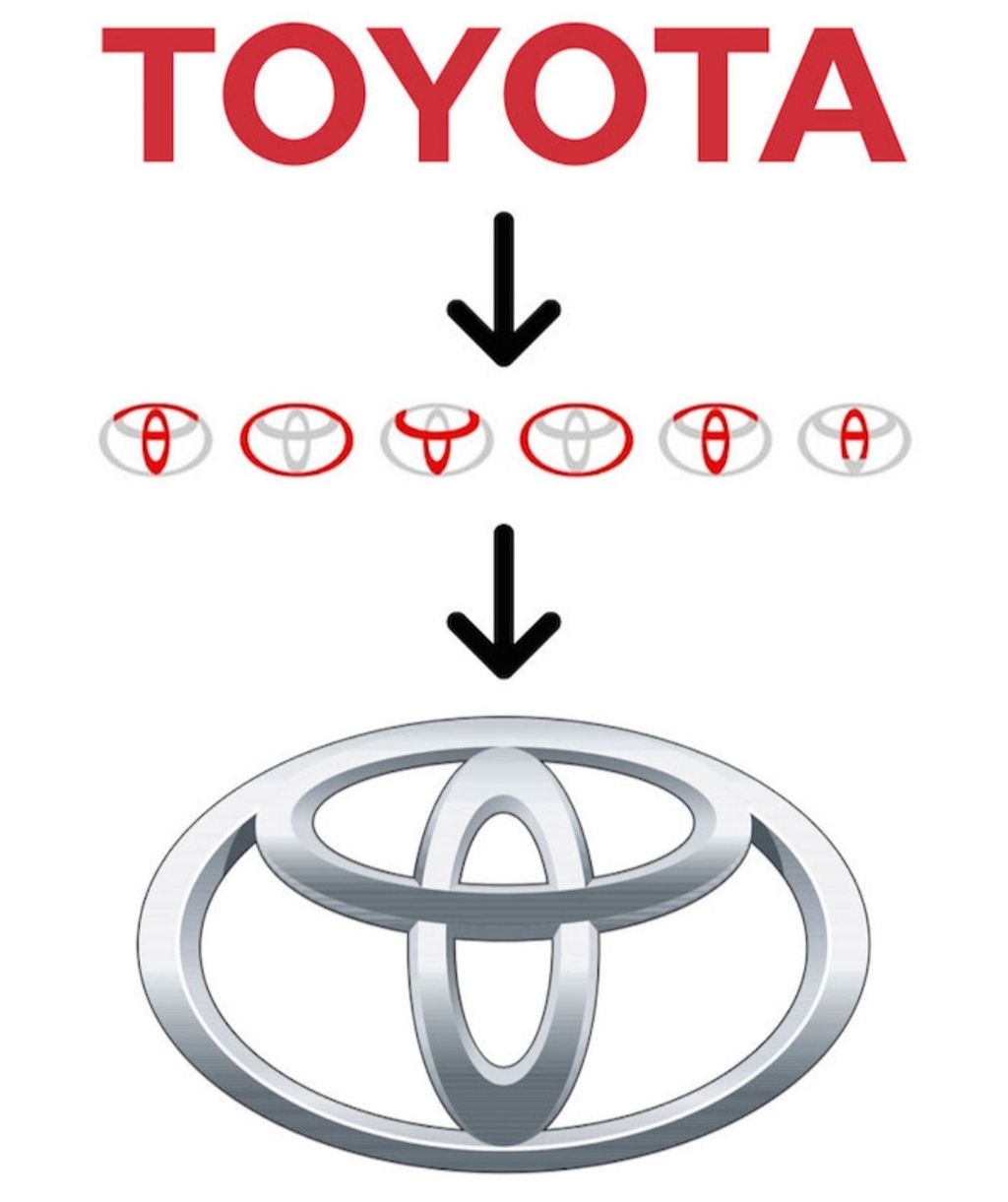
The logo or the car company has all the alphabet of it name in the three ellipses.
5. Hyundai.
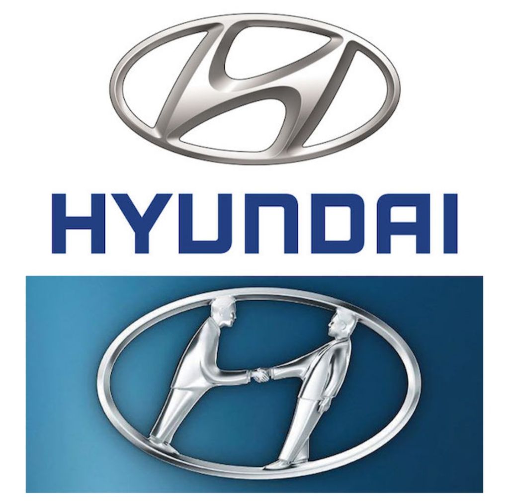
The company was found in 1967. The logo is not just the first letter of the company's name but it represents two people shaking hands, the costumer and the dealer.
6. Adidas.
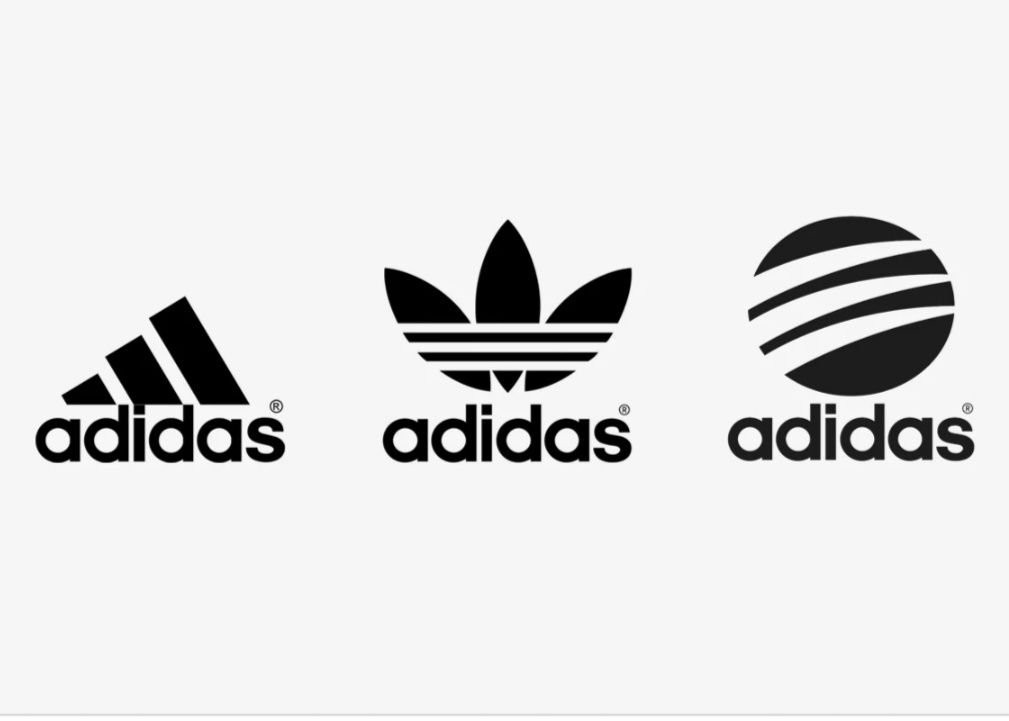
The name of the company is derived from the name of it's founder "AdolfDassler". The company was found in 1949 and since then it has changed it's logos a number of times but the three strips in the logos remained constant. The current logo has the three striped placed at an angle which forms a triangle or the mountain.
7. Vaio.
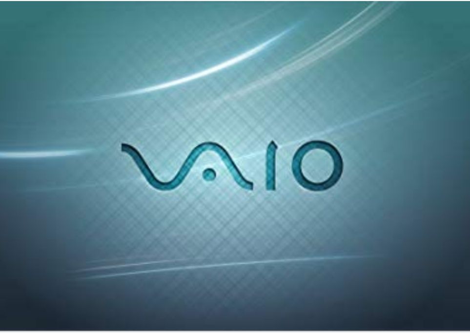
The company was found in 2014. The first two letters of the spelling represents an analog wave and the last two represents the numbers 1 and 0 which are the symbols of the digital singals or the language of computer.
8. Pinterest.
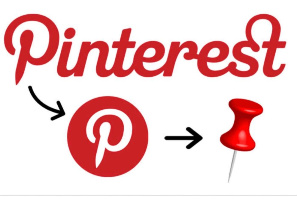
The people can collect the images from across the internet and pin them up on their virtual boards and the letter "P" hides the image of a pin. As the name suggested it pins the things of your interest.
9. Beats.
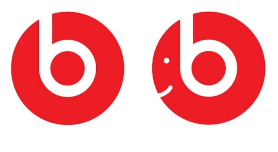
The American bases audio equipment company uses the letter "b" as it looks like the headphone on the person's head.
10. Subway.
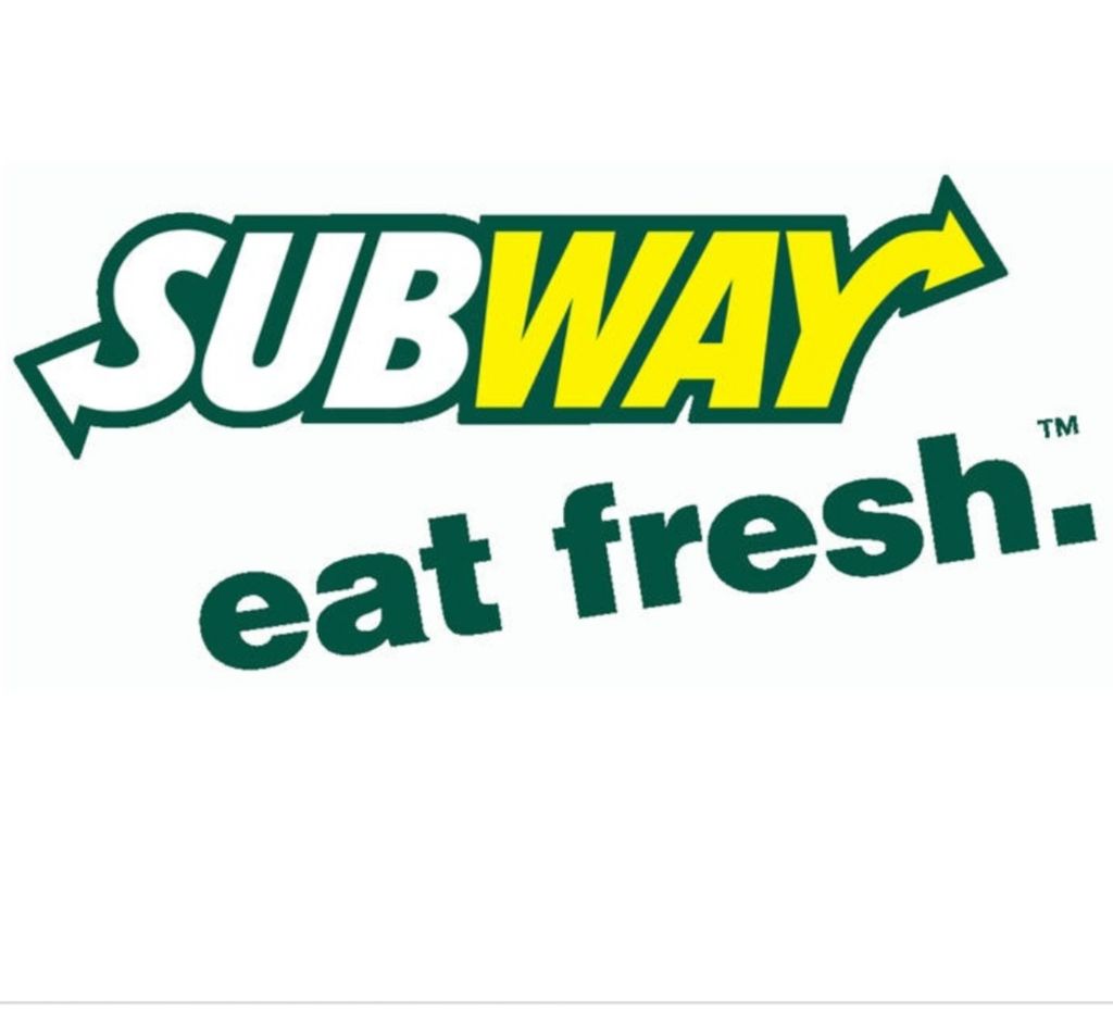
The arrow in the tail of letter "S" Represents the entire and the arrow on the head of letter "Y" Represents the exit. The name suggests that you can take an eating break on your way, the colour yellow and green reflects the sausages and the use of fresh vegetables and ingredients in the sandwiches.
